
3 24 2020 | Inspiration | wood construction
3 24 2020 | Inspiration | wood construction
Fire protected wooden facades and interiors are often treated with translucent fire retardant to leave the wood's natural grain visible. The colour and tone of the treatment should be chosen carefully, as the right impression depends on a number of factors. Nordtreat's colour expert shares some tips for choosing tones for wood.
Translucent fire protection is increasingly popular for wooden facades and interior cladding because the desired colours and required level of fire protection can be achieved with a single treatment. Industrial treatment with a translucent, durable and environmentally friendly fire retardant improves the cost-efficiency of wood construction.
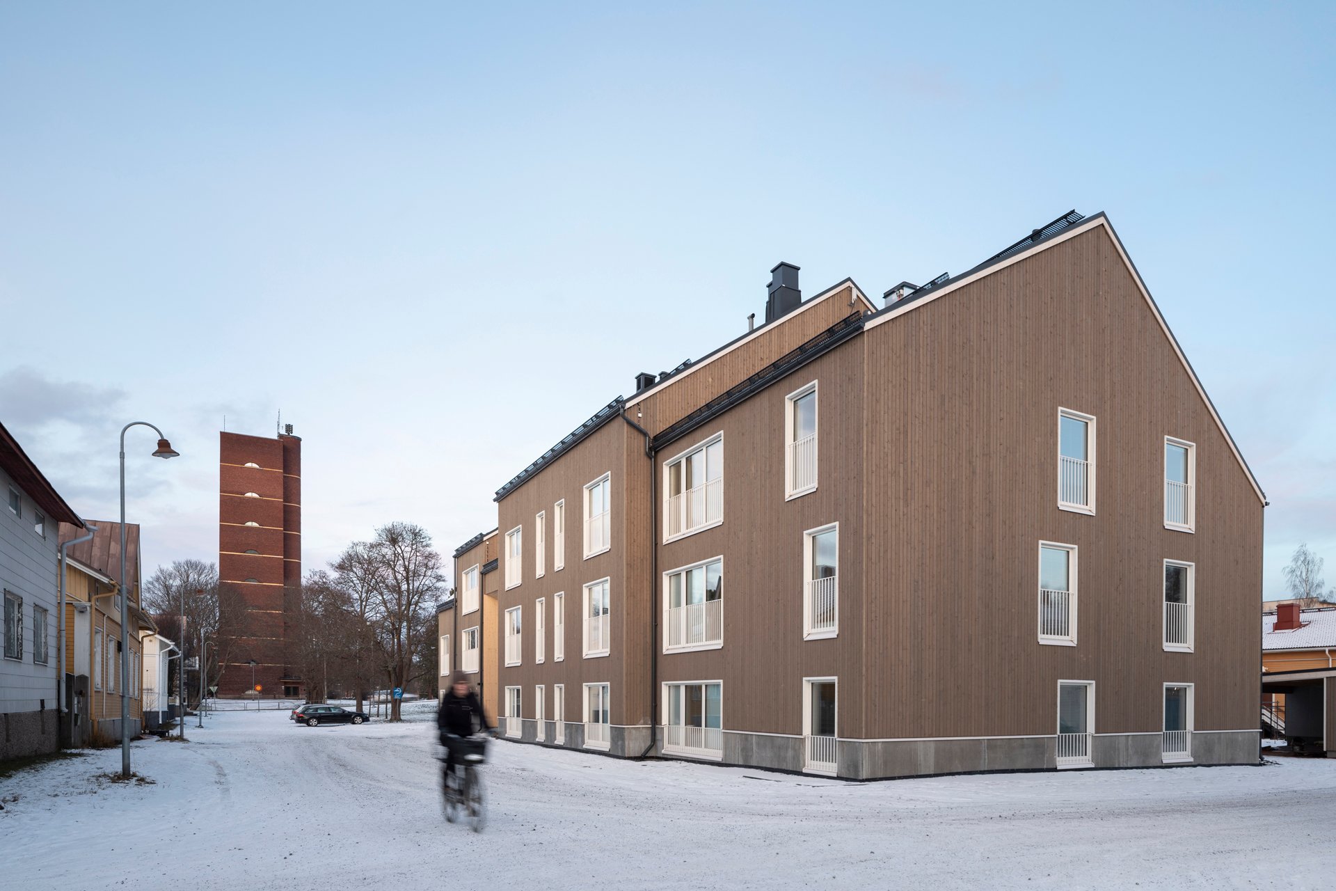
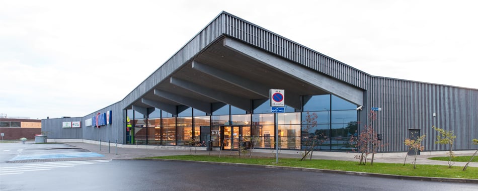
Trekoli, Pori, Finland
Wood is a natural material, which poses certain challenges for colours. The woods of different species are different colours to begin with. Professional advice will be highly useful when choosing a colour and tone for wooden cladding. Colour is light, and how we perceive different colours depends on many things, including the quality and area of the surface, as well as its surroundings and lighting.
Colour charts are commonly available as prints or digital versions. The base material will affect the colour, as different surfaces reflect light differently. The properties of paper, such as its smoothness and glossiness, will affect our perception of the colours printed on it.
If the same colour is viewed on a rough, porous and matt wooden surface, it will appear different. Aside from absorbing more light, rougher surfaces will also absorb more colour. The same colour will appear darker on wood than when printed on paper.
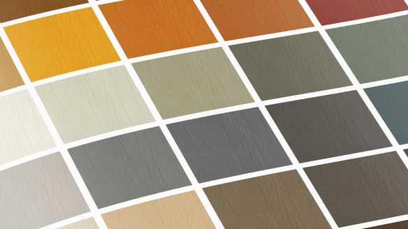
Digital colours are even more problematic, as different devices may have significant differences in how they display them. The safest way to compare colours is to order colour samples from the manufacturer to verify how the colour works on wood.
Colour charts usually have very small colour samples. The size of tinted wood samples will also be much smaller than the actual building or wall, for example. An easy rule of thumb is that colours will appear darker on large surfaces, compared to small sample pieces.
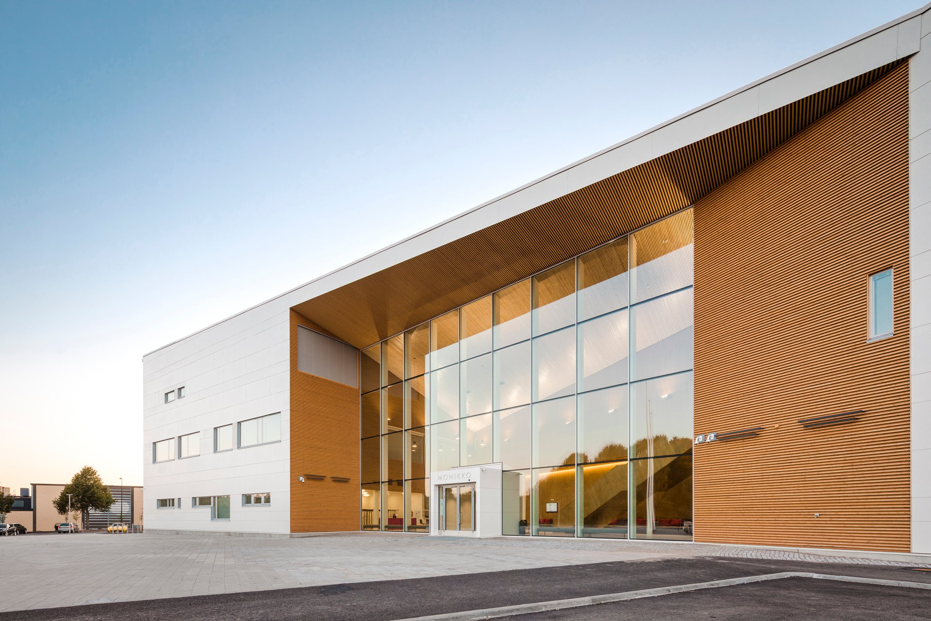
Monikko, Nurmijärvi, Finland
The other colours of the object and its surroundings will also have an impact, including the ratio of their surfaces. The effect of surrounding colours will depend on whether they are complementary or analogous colours. Complementary colours will enhance each other when used on walls and fascia boards, for example. In contrast, analogous colours will flatten one another in close proximity.
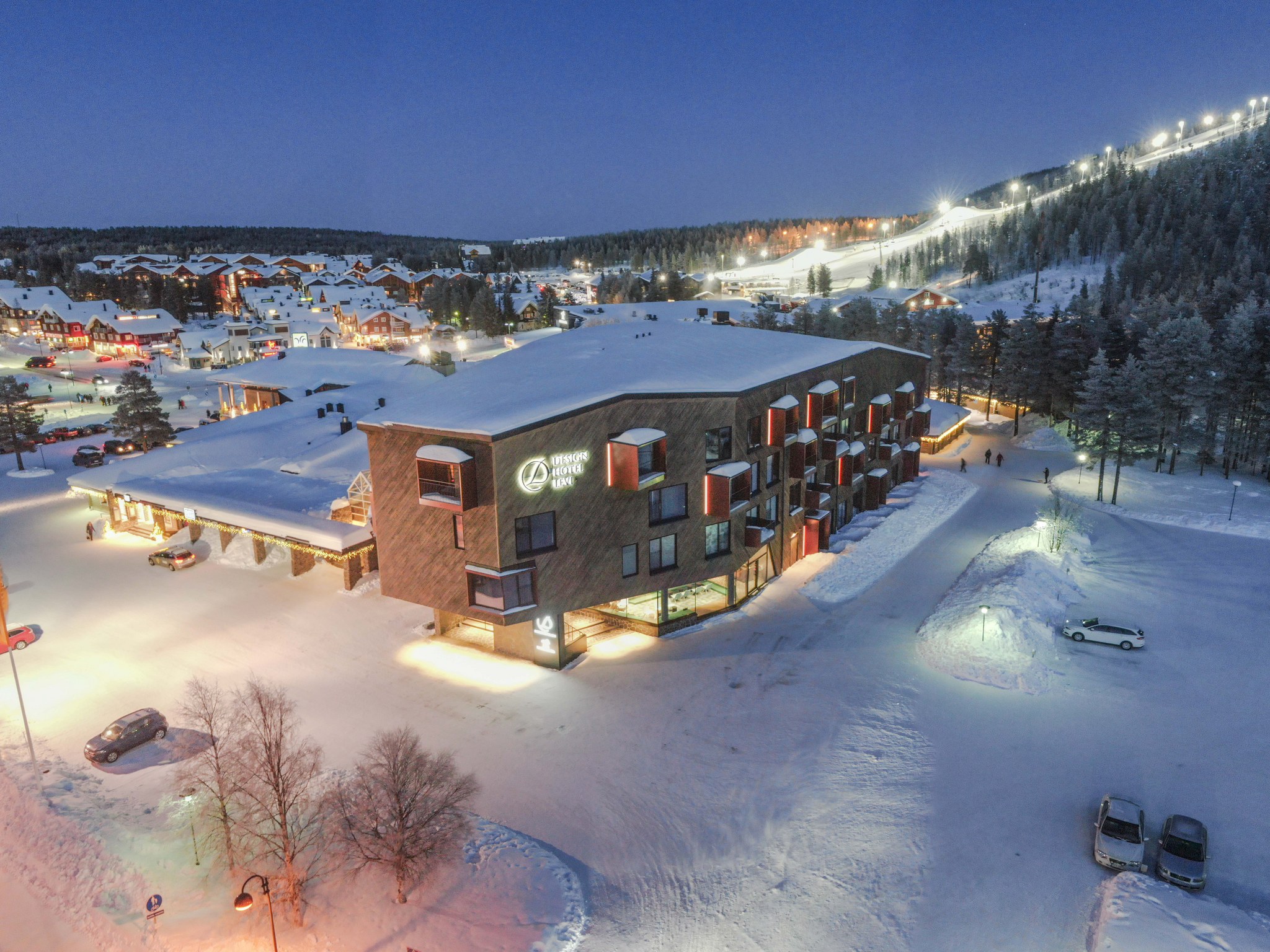
Design Hotel Levi, photograph Arno De La Chapelle
Environmental lighting is also important to consider for colours. The same colour will appear different in daylight, low light and artificial light.
The designer should visit the site in different weather conditions, and even at different times of the year, to guarantee the desired result. How does the colour look on a sunny day and a cloudy day? What is the colour like in the brightest summer, on grey autumn days and in the wintertime when snow reflects blue light? What colours can be found in the surrounding nature and buildings?
Maksima, Viimsi, Estonia
If the building has a large facade, the tone should be a grade or two lighter than on a sample.
Interior surfaces usually have a smaller scale than exteriors, which makes more daring colours work better. The colour scheme should be considered according to the room's type, use and required lighting. Bright light will make colours more intense than dimmer lighting.
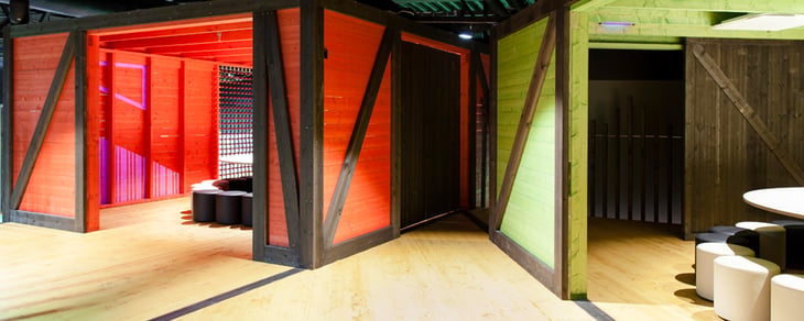
Muuuv, Viimsi, Estonia
The proportions of the room will also affect the impression given by the colours. For example, a dark back wall in a rectangular room or hall can make the space appear to be squarer. Similarly, wide cornices are fine in a high room, but will make a low room appear even lower, so a narrow cornice should be used instead.
An even tone is the primary objective for the colours of Nordtreat fire retardants. Testing is required to best evaluate the final tone on a wooden surface. These tests are carried out by applying different amounts onto grained paper.
The resulting colours and tones are evaluated in a rack with a neutral grey interior and SI-standardised lighting conditions. Averaged daylight (standard illuminant D65) is projected onto the samples at a 45-degree angle to reduce brightness to a minimum.
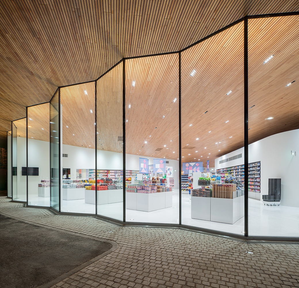
Fazer, Vantaa, Finland
In addition to the correct tone, the amount required for fire protection must also be considered in the colour design. Only the appropriate amount will ensure that the final product's properties match its fire class.
We can help you choose the right colours for your project. You can order tone samples with select colours and panel types or contact our technical customer support!


Keep on track about fire safety of wood products. Our newsletter provides you with the latest ideas and solutions.

 |
 |
 |